Back to the Web Design Home Page Buy Now - available at Amazon.com
Overview Chapters Examples Resources
Chapters
Complete Chapters
Chapter 1

Chapter 5

Chapter 9

Chapter 13

Appendix B


Check Out These Other Books!

Chapter 13: Color
Using Color
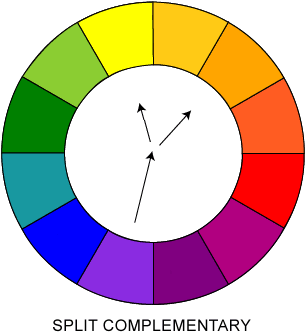
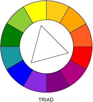
Even when color is reproduced properly, it isn't difficult to abuse it. A few too many drastically different colors in use at once might be so garish as to drive users away. Color harmony attempts to find pleasing combinations of colors. Yet even when harmonious, colors may not provide enough contrast and thereby affect usability. Finally, colors have implied meanings that should be considered.

Color Harmony
When using color, designers generally attempt to put things in balance. Too much color can be over stimulating and chaotic, while too little color can be boring. When using color, we strive for harmony—in other words, we use color in a pleasing way. Of course, while this may seem to be more a matter of taste, color theory has long shown how certain color combinations work well together, while others do not.

The most basic tips for good color use are

  • Use only a few different colors on a page.
  • Do not use an excessive amount of colors.
  • Use hot and cool colors together.
We can come up with some common schemes for finding pleasing color combinations using the color wheel presented earlier in the chapter. The simplest way to do this is to select colors near each other on the color wheel. The scheme is described as analogous. Colors directly opposite on the color wheel also work well together and are considered complementary. For variation, you can try nearly complementary colors or three colors that form an equilateral triangle in the color wheel. Such a color scheme is called a triadic color scheme. Color harmony diagrams illustrating the previous ideas are shown in Figure 13-3, with examples found at www.webdesignref.com/examples/colorharmony.htm.

Triadic Color Scheme: Analogous
Triadic Color Scheme: Split Complementary
Triadic Color Scheme: Complementary
Triad
Figure 13-3. Sample color harmony diagrams

Finally, plain black and white plus a color is the easiest harmony. While a little boring, it is safe and looks pleasing, particularly if the color used is vibrant so as to show contrast with the neutral black and white.


Next: Color and Usability


Overview | Chapters | Examples | Resources | Buy the Book!
Available at Amazon.com Available at Amazon.com